Market data for business electricity and gas
The chart below shows trends for wholesale gas market data for the 12 months period of July 2015 – January 2016. The chart presents composite prices for gas.
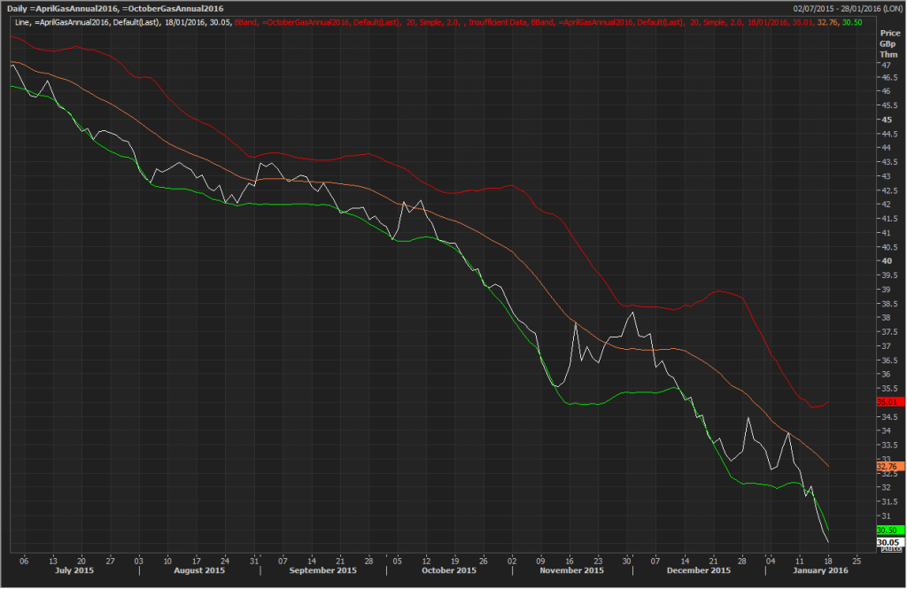
The orange gradient line in each graph shows the electricity and gas wholesale prices. The red, yellow and green bandings are called Bollinger Bands.
DEFINITION of ‘Bollinger Band®’ A band plotted two standard deviations away from a simple moving average, developed by famous technical trader John Bollinger. Read more: Bollinger Band Definition in Investopedia
The yellow line is an exponential moving, average price with the red and green bands showing the upper and lower limits respectively. The closer the actual price (orange) is to the green band indicates that the current wholesale price is good value compared to the moving average and hints at being a good time to look at purchasing. Conversely, if the actual price nears the red band this shows that the current price is bad value compared to the moving average.
Notice that in January 2016, gas price is actually below the green band due to the recent plunge of oil price.
